
Leading Consulting Firm Homepage Redesign
Reimagining BCG’s digital home to showcase the depth and breadth of their knowledge and expertise.
Art Direction / Creative Strategy / User Experience Design / Interface design
This project was the beginning of an ongoing partnership between the design and marketing teams to deliver focused, thoughtful and intentional change to position the company as a guiding voice leading in a vast array of industries and capabilities. The project challenge was managing the complexity and magnitude of the ask in an agile and adaptable way, identifying the most impactful improvements in the design system and its modularity to allow flexibility to hold different types of content to cater to different audiences.
My challenge leading the design team was to balance the evolving needs and priorities of our internal stakeholders with the pressing needs to improve the experience for the external audience, all while guiding a global design team working in a flexible model with simultaneous workstreams.
Why am I sharing this case?
This case shows my ability to lead parallel efforts with multiple designers while ensuring visual consistency throughout all pieces. It also demonstrates my capability to elevate an existing concept to give it purpose for a new effort.
Roles + Responsibilities:
Lead / Lead Designer / Art Director
Team Structure:
Team of 5 designer, 1 strategist
Timeline:
~3-4 months

Learning & Discovering
Demystifying the enormity of our problem, breaking it down to the essentials.
Our starting point was understanding the challenges of the current homepage, and how difficult it is for people to understand BCG's history and expertise as a leading consulting firm catering to numerous industries and services. We needed the homepage to reflect who BCG is as a company, its history, values, and extensive expertise and knowledge to provide thoughtful entry points to all the different parts of the website.
Approaching the user experience from a content-first perspective, to establish the company.
We needed a deep understanding of all the different types of content BCG offers as a leading voice in consulting and how best to organize and present such content to guide people seamlessly to explore the full breadth of BCG's expertise. We aimed to create a clear yet flexible hierarchy and labeling system where anyone could understand what industry and collection each thought piece belongs to or whether a specific initiative aligns with one of the company’s values or history.

We established a hierarchy and architecture of the relevant content from the site that was on the homepage. While auditing the webpage and analyzing its elements, we realized very few of the essential elements were displayed, and there was no apparent hierarchical order.
Thinking & Assessing
Flexible narratives guided by the range of needs and personas of such a broad audience.
The company’s audiences for the website involved an extensive range of people and needs. One end of this range is a first-time user that knows little about the company but is interested in a potential engagement and is looking to know more about BCG’s background. The other end is, a top-tier client with a long relationship with the company who wants to see more personalized content that aligns with their industry and needs. Including a lot of overlap and nuance within these two endpoints of the range.
Each audience group had commonalities in the way they wanted to use the site and how new they were to the site, therefore we tailored our approach based on the frequency of visits
To design for such a broad range of people, our team used a flexible and agile approach to cater to their needs. We created adaptable and modular design models to customize content and compose specific narratives for each audience, adapting to prioritize each personas’ needs. We made all these decisions while keeping in mind that any design proposed needed to fit into the possibilities available within the current CMS system used.
The narratives have common elements that are prioritized in the narrative flow or adapted to tailor the page to each audience
Focusing & Pivoting
Designing empty modular systems, providing an adapt-as-you-see-fit approach.
Instead of designing fixed flows for the homepage, in which each CMS module would showcase a specific piece of content within the page, we created a small set of modules that could be mixed and matched. These modules have enough versatility to hold different types of content and include several variables, whether visual or content-specific, that would allow us to customize them to the business and audience needs.
For example, in the case of content-specific variables, our hero banner can adapt to show one featured article, one expandable collection, or even a set of 2 featured elements, whether they are articles or collections.


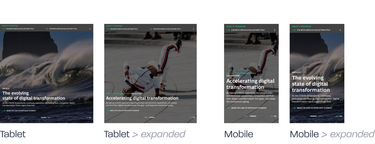
On the other hand, we have modules that feature three pieces of content, whether articles, initiatives, or anything about BCG, either in a grid or column format. These modules have several visual variables that allow us: to change the background to a color, gradient, or image, as well as possibly include thumbnails for each piece of content.


3
types
of content
14
new types
of modules
53
module
variations
159
responsive adaptations
Focusing & Pivoting
Composing adaptable narratives for all audiences, with a modular system designed to mix and match.

Focusing & Pivoting
Designing our client’s experience, approaching project management as a service design challenge.
The project provided a unique opportunity to view the entirety of the engagement with the marketing team from a service design perspective, not only to create a strategy for the design itself but also to compose the best way to present it and get our stakeholders on board. We focused on optimizing how they would best experience and digest the design system created to showcase the value added to invest time and effort in implementing our proposals.
Our designed documentation is the result of this effort, wherein a simple and straightforward way we outlined all the potential for each of the modules so that even if it involved a big effort to code new modules, it would be clear of all the possibilities it offered as an expansion and elevation of the current design of the site.
Want to see more?
Explore prototypes
Always learning, and evolving
How did creating this project help me be the designer I am today?
This project helped me evolve my discovery process to adapt to the clients' ways of thinking and working and get the most out of our discovery workshops.
I grew immensely as a creative leader, working with our team to guide us all to nimbly adapt to ever-changing needs and priorities while maintaining our stakeholders in mind.
Since the project involved only a portion of a website, I improved my prioritization skills, sharpening a quick decision-making habit to identify what was most pressing to tackle in this initial engagement.
Soft skills improved or gained
Listening, interviewing, communication, presentation/pitching, critical thinking, problem-solving, project management, creative leadership, adaptability, prioritization, strategic planning, work under pressure, systematic approach.
Looking back, what would I do differently?
I would have pressed a bit more and insisted on allowing more time for user research and testing to validate our efforts.
I would want to dedicate time to fully expand and optimize the design system to carry out more efficiently for the upcoming phases of this redesign engagement
Design skills improved or gained
UX Research, User modeling/mapping, UX Design, Information Architecture, UI design, (knowledge on typography, hierarchy, composition, color theory, common UI patterns, visual strategy), Usability Testing, Prototyping.
Main Software: Figma
View Next Case
Leading cruise company online experience
Creative Strategy / User Experience Design /
Interface design
Reinventing the experience of booking a cruise online to be innovative, approachable, and user-friendly.
